PINC Sarasota 2017
PINC is a one day experience that brings together brilliant people to present their crafts, stories, and causes. Each speaker shares unique and inspiring stories of philanthropy, insight, environmentalism, and creativity, making PINC a one-of-a-kind event that guarantees its audience a new perspective on the world.
I was very privileged to have worked on this opening video, which was used to kick off the day and preface each time block. Designer Alyssa Gibson created the concept and visual language, while I worked in collaboration with David John Reyes to refine and solidify rules and themes, which made animating a smooth process and a well-unified final piece.
PINC Sarasota 2017
PINC (People, Ideas, Nature, Creativity) is a one day experience that brings together influential and insightful people from around the world to present their crafts and causes. Each unique and inspiring guest speaker shares powerful stories of the people they've met, the ambitious ideas they've pursued, the places they've been, and the ingenuity they've conjured to make the world more beautiful and interesting.
I had the privilege of collaborating with graphic designer, Alyssa Gibson and motion designer, David John Reyes to develop a visual language for this year, as well as designing and animating this opening sequence, which was played to kick off the event.
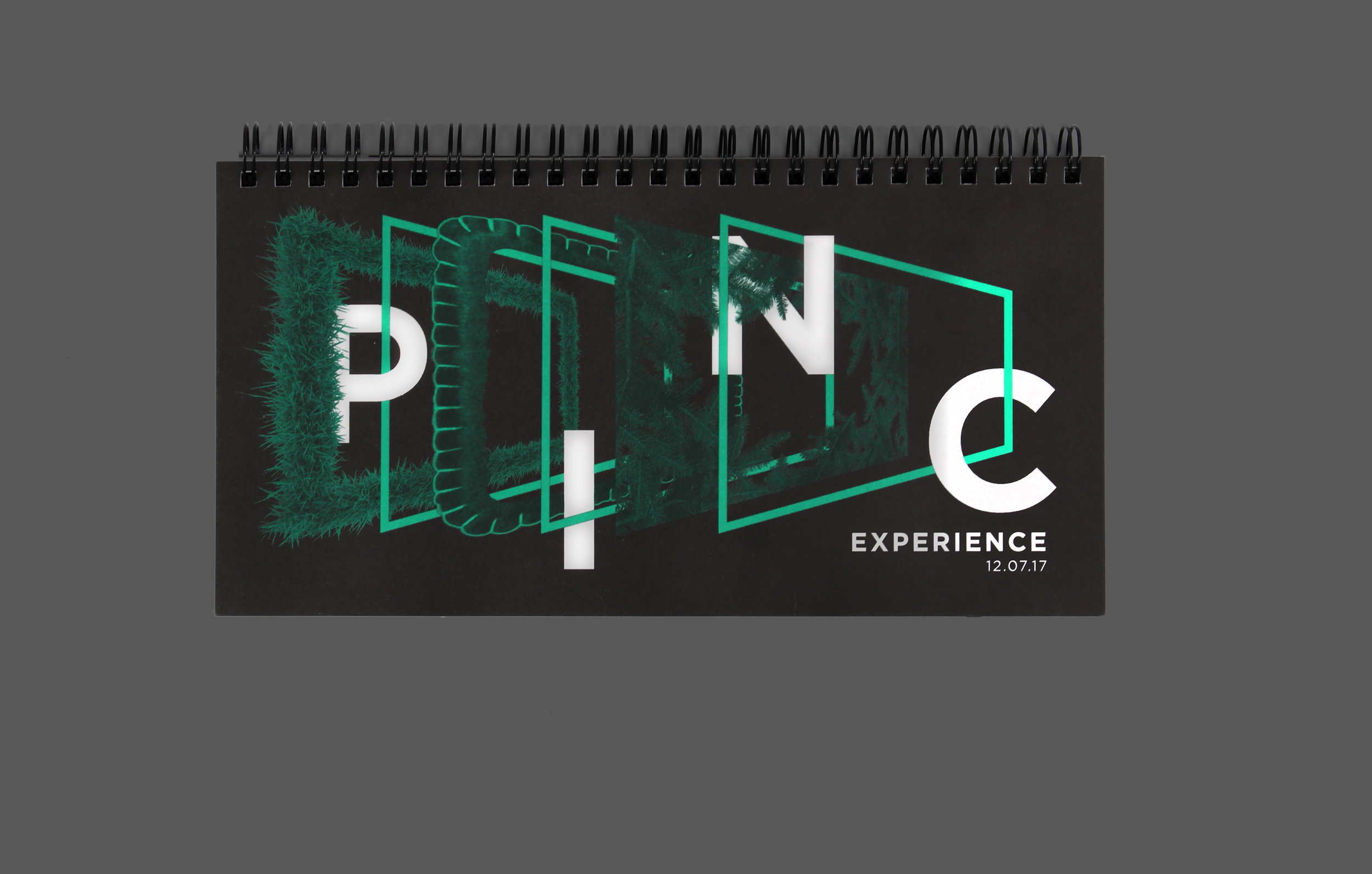
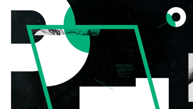
Alyssa's initial concept was built upon the theme of "multi-dimensionality." Somewhat ironically, David and I decided to translate this into a 2D world. We used shapes and type within mattes, more shapes (or photographic elements), strokes, blending modes, and even more shapes. The idea was to create dimension through layering and blending media, a harmony of tactility and sharpness. This was to reflect the both human and futuristic sides of the PINC brand.
As our process developed, we began gathering a number of design rules which we closely obeyed. Probably the most straight-forward was to use angles in every frame, and to have every angle on an increment of 15º. We also decided to only use basic formal shapes.
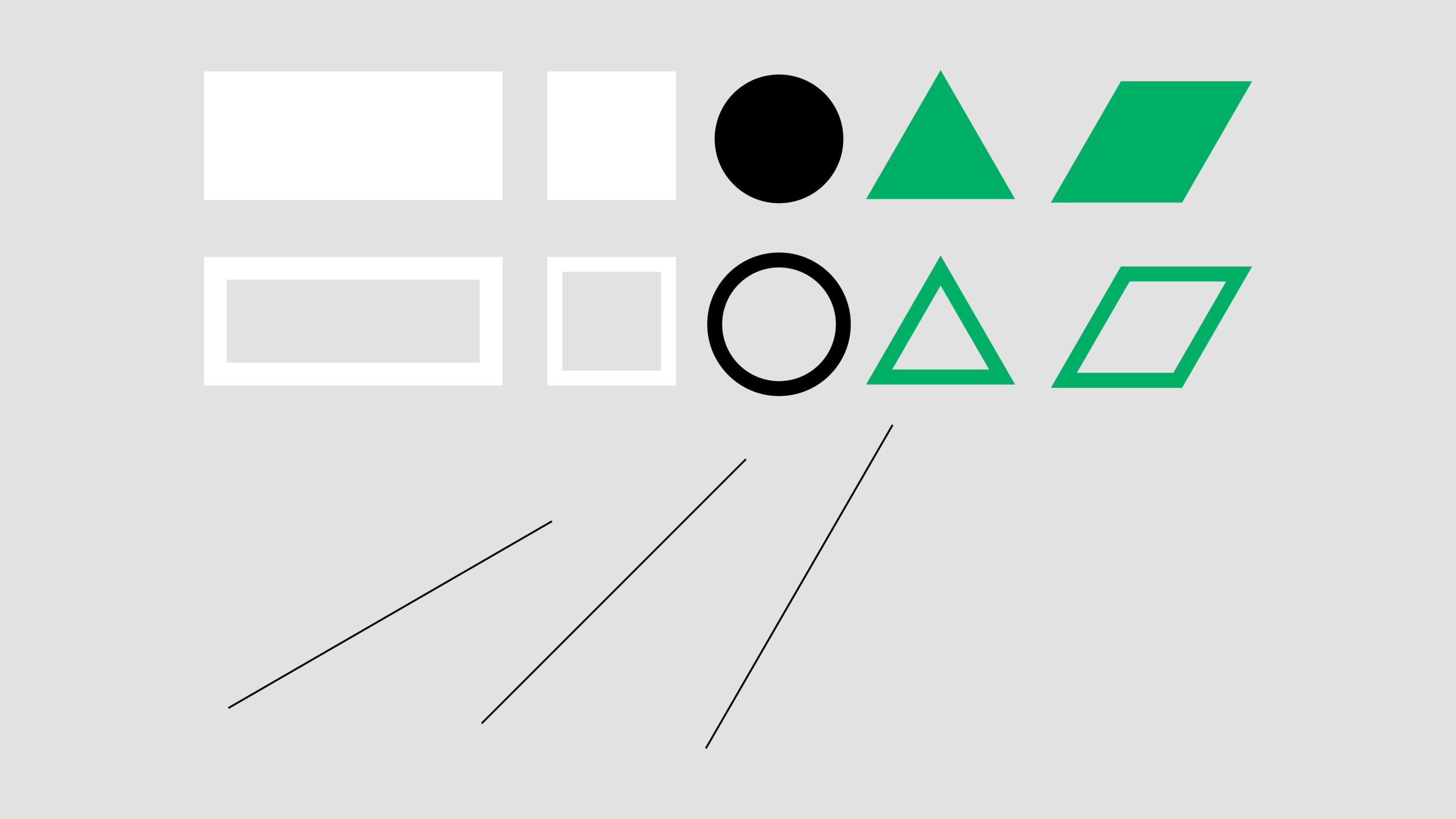
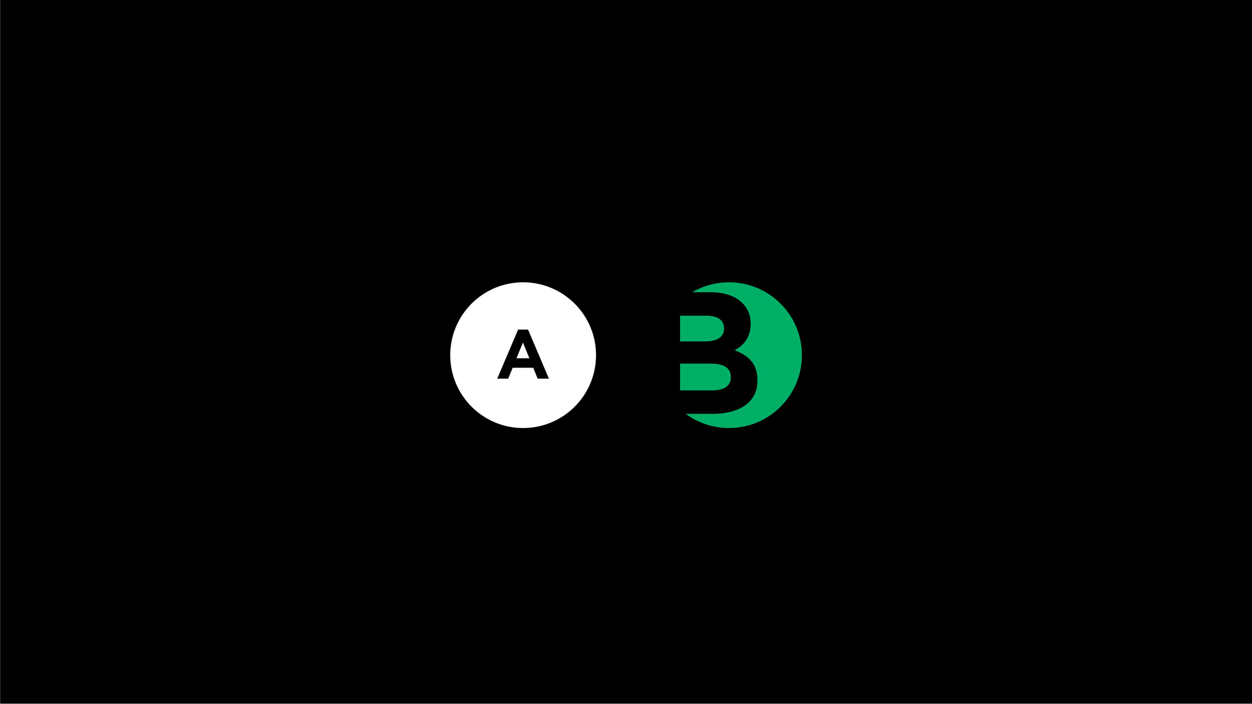
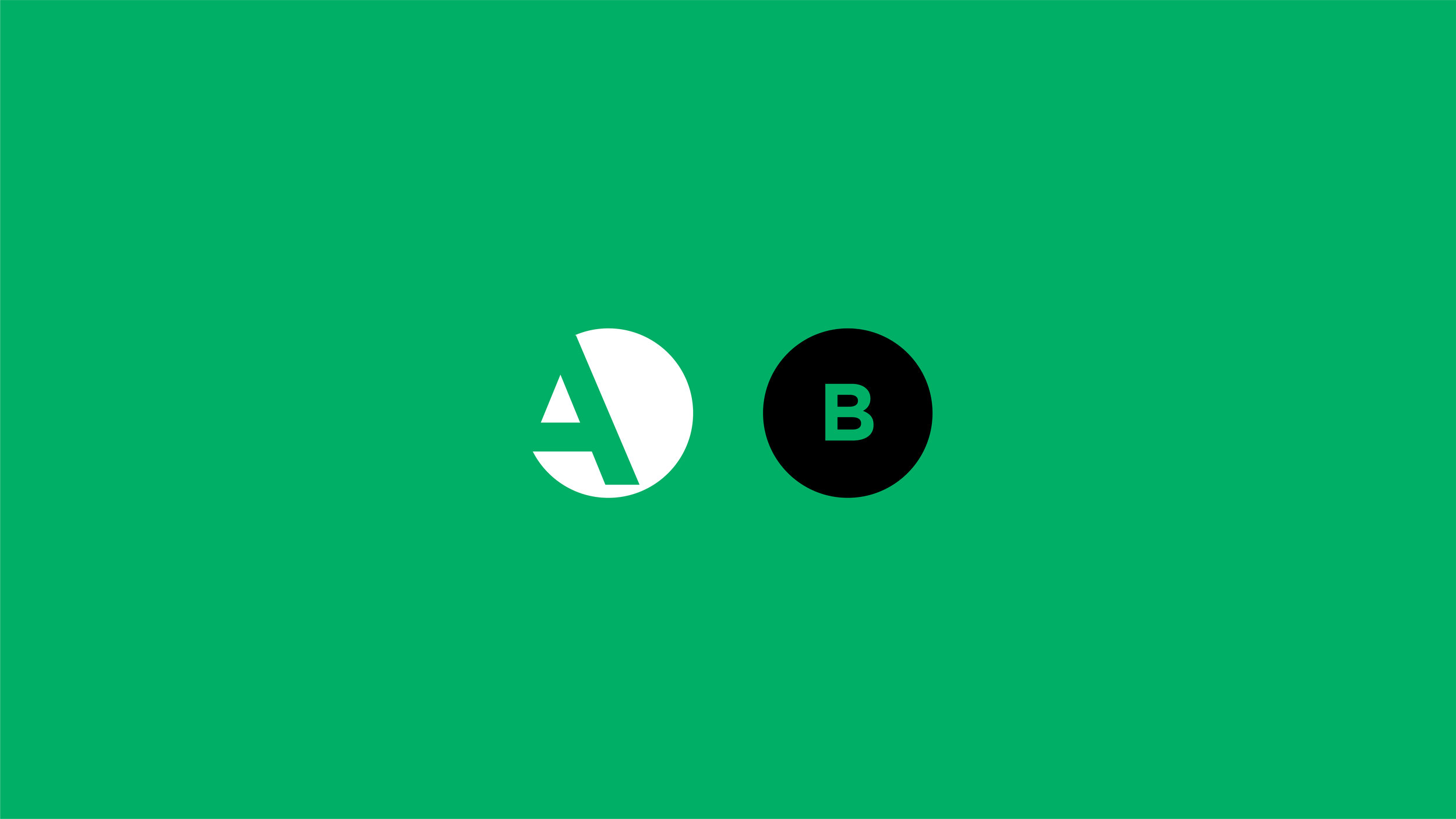
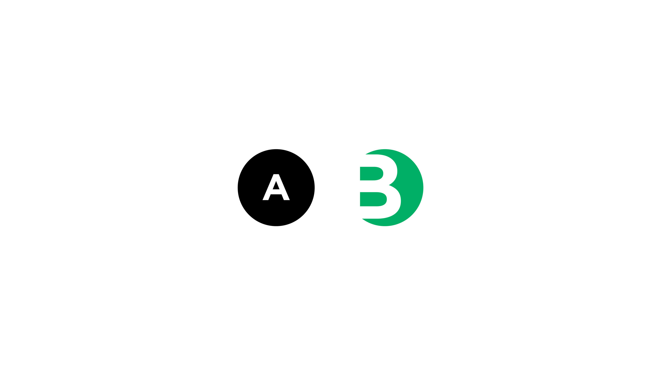
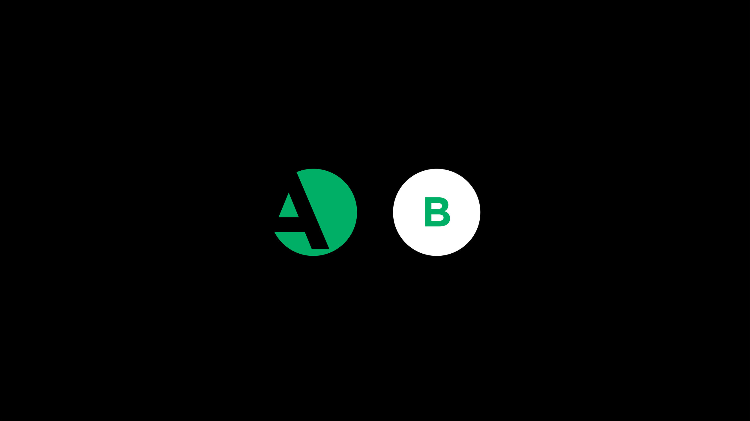
The main thing that brought this piece together is the way we decided to organize it. The name PINC (People, Ideas, Nature, and Creativity) sums up the entire brand as it is. That's where we started with our idea for the sequence. Each letter would be given a title card, followed by A and B compositions with relevant letters and photos. The color scheme of the PINC brand is black, white, and green. So, we took all possible combinations of those three colors and applied them to our style frames, placing them in an order that allowed us to make figure ground reversals between each composition. As an added element, we also switched between using letters that sit inside the frame and letters that break the frame.
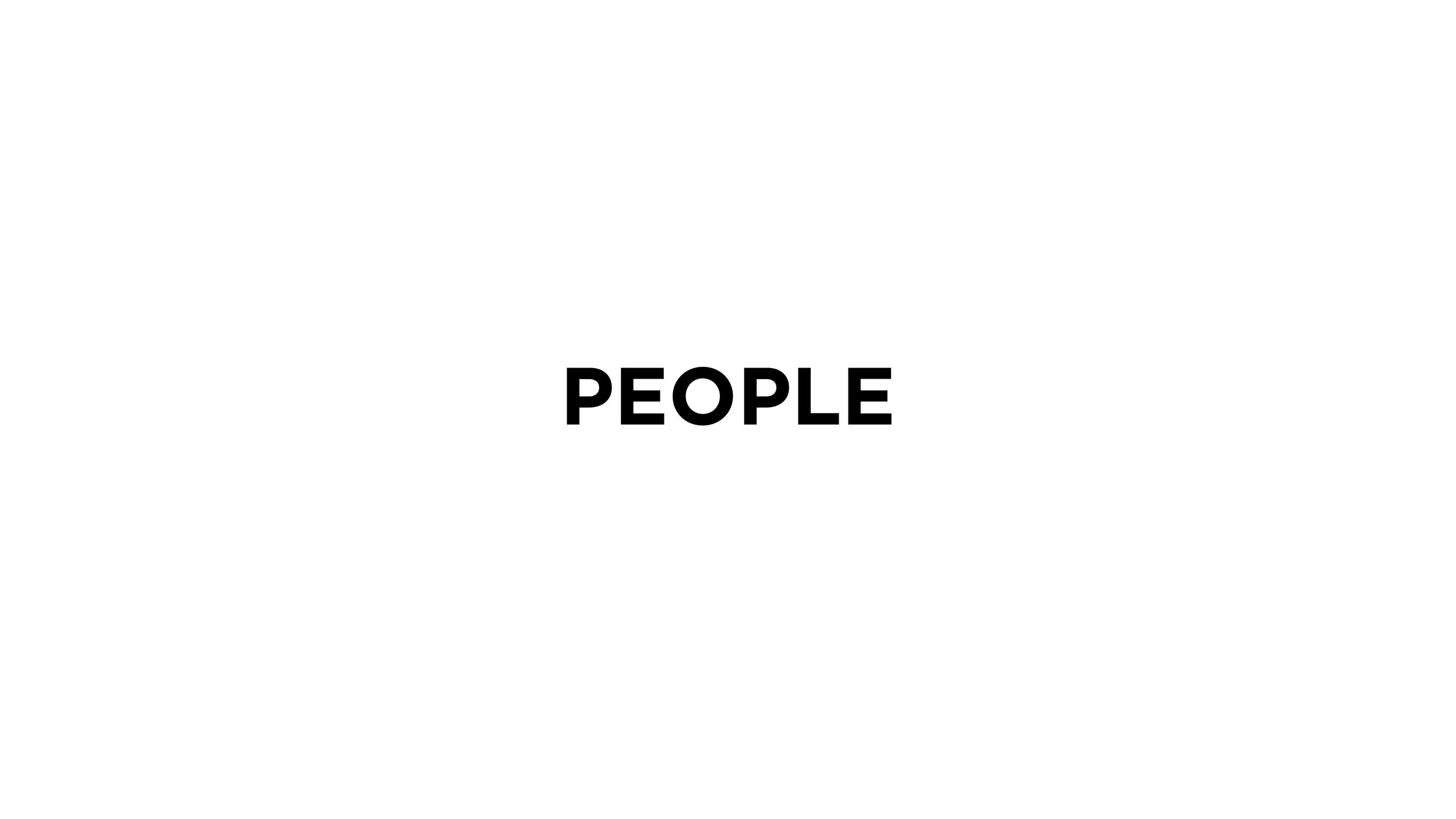
For example, the title card for PEOPLE uses black on white. Then it transitions into the A composition, which uses a black background with white and green on top, and letters inside the frame. Then comes the B composition, which uses the same color scheme, but with letters that break the frame.
David and I essentially cut the work in two. Our work styles and tendencies are relatively similar, but we knew they would still be slightly different. We staggered the sets of compositions we made so it balanced out.
After we made this framework, all we had to do was plug in the designs. Once the style frames were finished, they went straight into After Effects. Then all that was left was to sprinkle in some keyframes. We made it a rule to keep the animation in constant, each composition blending into one another to once more push multi-dimensionality and suggest how every category is related. It also just looks better that way.
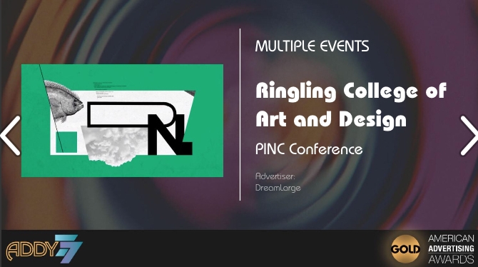
Our package took home two gold ADDYs at the local level! We are hoping to find out soon about regionals...
